Theming Shadcn Vue The Easy Way
Learn how to theme shadcn-vue quickly using CSS variables, Tailwind, and shadcn-theme.
Theming Shadcn Vue The Easy Way

Learn how to theme Shadcn Vue the easy way.
shadcn-vue is a collection of re-usable vue components that you can copy into your application to use like they are your own components.
Theming is done with a combination of CSS variables and Tailwind CSS. Theming can be difficult unless you use one of the predefined themes. This article will show you how to create a custom theme for shadcn-vue painlessly.
Prerequisites:
Before we get started, you should have a project setup with vue/nuxt, tailwind and shadcn-vue. If you don't have a project setup, you can use the following resources to get started:
Step 1: Create a new theme
The recommended way to create a new theme is to use hsl colors. This can be hard to do if you are not familiar with hsl colors.
This is where shadcn-theme comes in. shadcn-theme is a tool that generates a theme for you based on the colors you provide. You are able to change every css variable that shadcn-vue uses and shows you a live preview of the theme. Once you are satisfied with the theme, you can copy the css variables and paste them into your project.
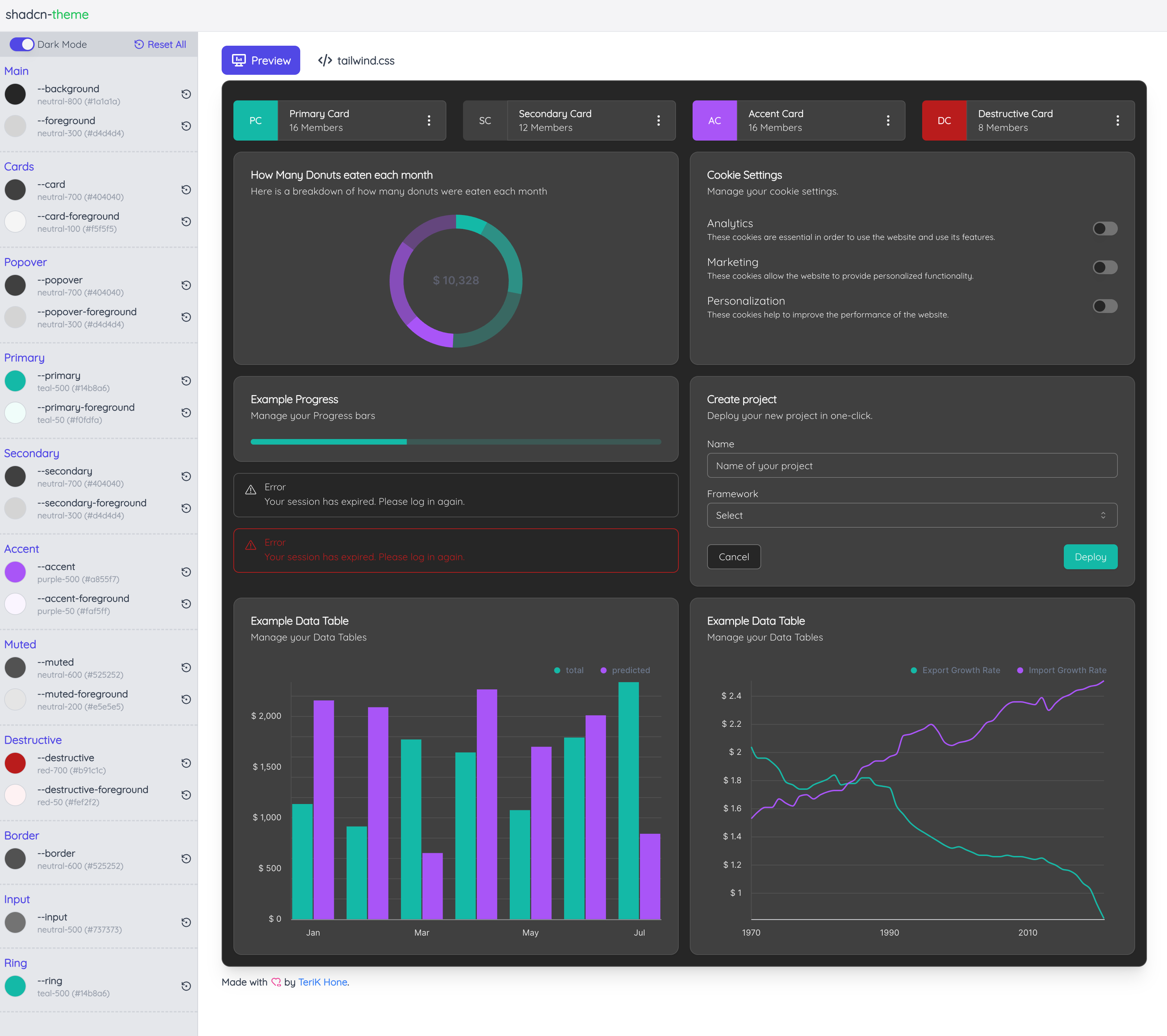
Once you navigate to shadcn-theme you will see a screen like the one above. You can change the colors by clicking on the various color pickers next to the associated css variables. You are able to select between a custom color and any of the predefined tailwind colors. As you change the color the live preview on the right will update to show you how your theme will look.
One of the best features of shadcn-theme is the ability to switch between light and dark mode while you are in each mode it will only update the appropriate css variables. This allows you to create a theme that looks good in both light and dark mode.
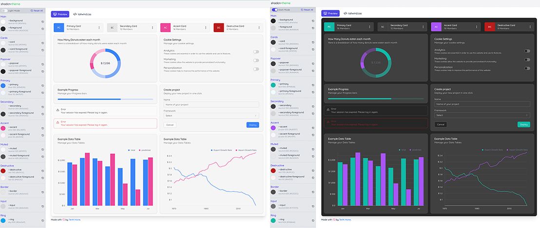
Step 2: Apply the theme to your project
Once you are satisfied with your theme click on the tailwind.css tab at the top. On that tap you can copy the css
variables and paste them into your project.
@layer base {
    :root {
      --background: 0 0% 98%; /* neutral-50 (#fafafa) */
      --foreground: 0 0% 14.9%; /* neutral-800 (#262626) */
      --card: 0 0% 96.1%; /* neutral-100 (#f3f4f6) */
      --card-foreground: 0 0% 25.1%; /* neutral-700 (#404040) */
      --popover: 0 0% 96.1%; /* neutral-100 (#f5f5f5) */
      --popover-foreground: 0 0% 14.9%; /* neutral-800 (#262626) */
      --primary: 217.2 91.2% 59.8%; /* blue-500 (#3b82f6) */
      --primary-foreground: 213.8 100% 96.9%; /* blue-50 (#eff6ff) */
      --secondary: 0 0% 89.8%; /* neutral-200 (#e5e5e5) */
      --secondary-foreground: 0 0% 25.1%; /* neutral-700 (#404040) */
      --accent: 330.4 81.2% 60.4%; /* pink-500 (#ec4899) */
      --accent-foreground: 327.3 73.3% 97.1%; /* pink-50 (#fdf2f8) */
      --muted: 0 0% 96.1%; /* neutral-100 (#f5f5f5) */
      --muted-foreground: 0 0% 32.2%; /* neutral-600 (#525252) */
      --destructive: 0 73.7% 41.8%; /* red-700 (#b91c1c) */
      --destructive-foreground: 0 85.7% 97.3%; /* red-50 (#fef2f2) */
      --border: 0 0% 89.8%; /* neutral-200 (#e5e5e5) */
      --input: 0 0% 83.1%; /* neutral-300 (#d4d4d4) */
      --ring: 198.6 88.7% 48.4%; /* sky-500 (#0ea5e9) */
    };
    .dark {
      --background: 0 0% 14.9%; /* neutral-800 (#1a1a1a) */
      --foreground: 0 0% 83.1%; /* neutral-300 (#d4d4d4) */
      --card: 0 0% 25.1%; /* neutral-700 (#404040) */
      --card-foreground: 0 0% 96.1%; /* neutral-100 (#f5f5f5) */
      --popover: 0 0% 25.1%; /* neutral-700 (#404040) */
      --popover-foreground: 0 0% 83.1%; /* neutral-300 (#d4d4d4) */
      --primary: 173.4 80.4% 40%; /* teal-500 (#14b8a6) */
      --primary-foreground: 166.2 76.5% 96.7%; /* teal-50 (#f0fdfa) */
      --secondary: 0 0% 25.1%; /* neutral-700 (#404040) */
      --secondary-foreground: 0 0% 83.1%; /* neutral-300 (#d4d4d4) */
      --accent: 270.7 91% 65.1%; /* purple-500 (#a855f7) */
      --accent-foreground: 270 100% 98%; /* purple-50 (#faf5ff) */
      --muted: 0 0% 32.2%; /* neutral-600 (#525252) */
      --muted-foreground: 0 0% 89.8%; /* neutral-200 (#e5e5e5) */
      --destructive: 0 73.7% 41.8%; /* red-700 (#b91c1c) */
      --destructive-foreground: 0 85.7% 97.3%; /* red-50 (#fef2f2) */
      --border: 0 0% 32.2%; /* neutral-600 (#525252) */
      --input: 0 0% 45.1%; /* neutral-500 (#737373) */
      --ring: 173.4 80.4% 40%; /* teal-500 (#14b8a6) */
    }
  }
If you followed along with the nuxt setup guide in the shadcn-vue
documentation you would paste the vales into the assets/css/tailwind.css file.
@tailwind base;
@tailwind components;
@tailwind utilities;

@layer base {
    :root {
        --background: 0 0% 98%; /* neutral-50 (#fafafa) */
        --foreground: 0 0% 14.9%; /* neutral-800 (#262626) */
        --card: 0 0% 96.1%; /* neutral-100 (#f3f4f6) */
        --card-foreground: 0 0% 25.1%; /* neutral-700 (#404040) */
        --popover: 0 0% 96.1%; /* neutral-100 (#f5f5f5) */
        --popover-foreground: 0 0% 14.9%; /* neutral-800 (#262626) */
        --primary: 217.2 91.2% 59.8%; /* blue-500 (#3b82f6) */
        --primary-foreground: 213.8 100% 96.9%; /* blue-50 (#eff6ff) */
        --secondary: 0 0% 89.8%; /* neutral-200 (#e5e5e5) */
        --secondary-foreground: 0 0% 25.1%; /* neutral-700 (#404040) */
        --accent: 330.4 81.2% 60.4%; /* pink-500 (#ec4899) */
        --accent-foreground: 327.3 73.3% 97.1%; /* pink-50 (#fdf2f8) */
        --muted: 0 0% 96.1%; /* neutral-100 (#f5f5f5) */
        --muted-foreground: 0 0% 32.2%; /* neutral-600 (#525252) */
        --destructive: 0 73.7% 41.8%; /* red-700 (#b91c1c) */
        --destructive-foreground: 0 85.7% 97.3%; /* red-50 (#fef2f2) */
        --border: 0 0% 89.8%; /* neutral-200 (#e5e5e5) */
        --input: 0 0% 83.1%; /* neutral-300 (#d4d4d4) */
        --ring: 198.6 88.7% 48.4%; /* sky-500 (#0ea5e9) */
    };

    .dark {
        --background: 0 0% 14.9%; /* neutral-800 (#1a1a1a) */
        --foreground: 0 0% 83.1%; /* neutral-300 (#d4d4d4) */
        --card: 0 0% 25.1%; /* neutral-700 (#404040) */
        --card-foreground: 0 0% 96.1%; /* neutral-100 (#f5f5f5) */
        --popover: 0 0% 25.1%; /* neutral-700 (#404040) */
        --popover-foreground: 0 0% 83.1%; /* neutral-300 (#d4d4d4) */
        --primary: 173.4 80.4% 40%; /* teal-500 (#14b8a6) */
        --primary-foreground: 166.2 76.5% 96.7%; /* teal-50 (#f0fdfa) */
        --secondary: 0 0% 25.1%; /* neutral-700 (#404040) */
        --secondary-foreground: 0 0% 83.1%; /* neutral-300 (#d4d4d4) */
        --accent: 270.7 91% 65.1%; /* purple-500 (#a855f7) */
        --accent-foreground: 270 100% 98%; /* purple-50 (#faf5ff) */
        --muted: 0 0% 32.2%; /* neutral-600 (#525252) */
        --muted-foreground: 0 0% 89.8%; /* neutral-200 (#e5e5e5) */
        --destructive: 0 73.7% 41.8%; /* red-700 (#b91c1c) */
        --destructive-foreground: 0 85.7% 97.3%; /* red-50 (#fef2f2) */
        --border: 0 0% 32.2%; /* neutral-600 (#525252) */
        --input: 0 0% 45.1%; /* neutral-500 (#737373) */
        --ring: 173.4 80.4% 40%; /* teal-500 (#14b8a6) */
    }
    * { @apply border-border }
}
Thats It! We are done!
Hit that refresh button and see your new theme in action. If you are not happy with the theme you can always go back to shadcn-theme and make changes until you are satisfied.